Font and Typographical considerations
Typography of body text is the first thing an author
should care about.
Typography is simply an art and style arrangement of
characters/words to make a language legible, readable, and
appealing when displayed.
Typography then has and aesthetic and practical purpose. Good
typography is a creative and skilled discipline @@..., and its is
not our goal to describe it more here.
Typography has to do with typefaces (fonts), size of letters,
word and line spacing, justifications and also the style, the
arrangement, and the appearance of the letters and the
layout.
Some of the characteristics Arabic scripts (dots, letters
shapes, cursively etc...) are challenging for Typography, and to
... We begin this section by giving some background on Arabic
style and Calligraphy and its history.
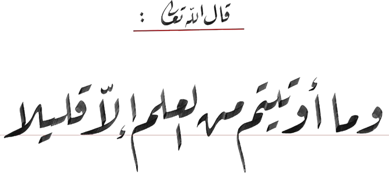
Arabic Style and Calligraphy
Arabic styling and writing has its origin in Islamic art and
civilization, essentially used to decorate mosques and palaces,
as well as in beauty manuscripts, books, and especially to copy
the Koran. Arabic script is cursive making it viable to
support different geometric shapes overlapping and
composition. Words can bewritten in a verycondensed formas well
asstretchedinto elongated shapes, so that scribes and artists of
Islam labored with passion to take advantage of all these
possibilities.
From the beginning of Arabic calligraphy, two tendencies or
two types of styles can be seen emerging, the handwriting for the
decoration of mosques and sculptures, complex and shaped enough,
and writing style reserved for writing the Koran, easier to use
and more readable.
Writings styles / Arabic Scripts then evolved according to
cultural diversity, leading to regional calligraphic schools and
styles (Kufi in Iraq, Farissi and
Taʻliq in Persia or Diwani in
Turkey), or to the purpose of writing, such as the copying
and dissemination of the Korʼan.
In general we group under the generic term
Naskh (copy/inscription) the scripts
which are meant for reading at smaller sizes suitable for
books and texts to be read, e.g. the Korʼan, and as
Kufi (from city of
Kufa in Irak) the stylish scripts ornaments
oriented. Although further named styles appeared during the
richer evolution of Arabic scripts.
Different Types of Writing Style
Basics and principles of Arabic writing were then defined by
Ibn Moqlah (886-940 Higra) @@add a ref. Welch 1979@@
who defined the Six Styles of writing: Kufi,
Thuluth, Naskh, Riqaʻ, Diwani and
Taʻliq.
- Kufi
- One of the oldest and well known Arabic scripts. It is
characterized by its decorative and prononced geometric
forms well adapted for architectural design. The style grew up
in the beginning of Islam for the need for Muslims to codify
the Koran. @@ The script has some variations as Al
Mouthafar, Al Mukhamal, Al
Handassi...)@@
- Thuluth
- (The third) One of the finest Arabic scripts by its beauty
and sight. Recognizable by the fact that the letters and words
are very interleaved in it complex form. May be the most
difficult in writing (need more skill), both in terms of
letters or in terms of structure and composition.
- Naskh
- One of the clearest scripts at all, with clearly
distinguished letters which facilitates the reading and
the pronunciation. Can be written with small size
(traditionally pens made of reeds and ink) which suits with
writing longer texts written in boards and books intended for
general population, especially the Koran. Currently
Naskh is considered the standard script for almost all
the Arabic and Muslim world.
- Riqaʻ
- The so-called in relation to a patcher, which is gazelle's
leather. Designed to be used for education, daily (not
artistic) writing and adopted in the offices (Diwan) of
the Ottoman Empire.
- Taʻliq
- aka Farisi(Iran), Taʻliq (hanging) combines Naskh
and Riqaʻ (and Thuluth?). Beautiful
script characterized by the precision and stretch of its
letters, its clarity and and lack of complexity. Considered as
one of the best scripts in the world and is favored by many
Arabs calligraphers.
- Diwani
- Used by Ottman court (Diwan) to write
official documents. Still in use today (e.g. hand written
documents by moroccan religious officers).
- Nastaaliq Farissi
- TBD as Persian version derived from Nas(kh) and
Taaʻliq. It is like a Taaʻliq but easier to write
and read...
Fonts and Styles
Until recent years, Arabic typefaces were not as common and
various as the Western ones. Although Arabic was subjected of
Western printing techniques, the number of different letters,
absence of upper/lower cases, contextual shapes, the joining of
the letters result in simplified typefaces.
The reasons might be both technical and historical /
cultural.
Is this because Arabic world, like other parts in the world,
came to the computer world more lately than the Western
world?
According to Bil'Ak, "Not enough designers from Arabic
word have paid attention to creating Arabic fonts or have
been slow to address challenges presented by adapting Arabic
script to screens", "May be because there are few specialized
typography courses available in the Middle East."
Other possible reason, is that not all typographic concepts
apply all to the Arabic script (e.g. serif, case...) and that
other characteristics should be handled carefully for
better readbility (@@to provide example@@).
Now, many tools are available to design Arabic fonts, to
better reach the Arabic language flourishness.
Summary
Yet to be completed...
| Style |
Description |
sample |
Pic |
Kufi
(Diwan
kufi here) |
Early time of
Islam
3rd or 4th century
applied to the early scripts used to write the Koran
difficult to write any long text |
الإعجاب بالكتابة
السحرية والمهارات |
 |
| Naskh |
The script of choice for
the Koran
Popular for writing books because of its legibility
Adapted for printing
The most common font in printed Arabic |
الإعجاب
بالكتابة السحرية والمهارات
الإعجاب
بالكتابة السحرية والمهارات |
 |
|
Nastaaliq |
Developed in Iran in the
8th and 9th centuries (wp)
Nas(kh)+Taaliq |
الإعجاب بالكتابة
السحرية والمهارات |
 |
| Reqa' |
This script evolved from
Naskh and Thuluth... |
الإعجاب
بالكتابة السحرية والمهارات |
 |
| Diwani |
Used in the Ottoman
court to write official documents
Difficult to read and write
Still in use today. Highly cursive with its letters
unconventionally joined together. |
الإعجاب
بالكتابة السحرية والمهارات |
 |
|
Thuluth |
Support Harakat
Indicators
Script par excellence for writing many different kinds of
texts
Used particulary for titles and architectural
inscriptions |
الإعْجَابْ
بالكِتاَبَةِ
السِّحْريَةِ وَالمَهَاراَت |
 |
Rabat
aka Maghribi |
Western Islamic world of
North Africa and Spain
Used for writing the Koran as well as other scientific,
legal and religious manuscripts
Not much used today. |
الإعجاب بالكتابة
السحرية والمهارات |
 |
| Taaliq |
Arabic calligraphy
designed for Persian language. Until replaced by
Nastaaliq |
الإعجاب بالكتابة
السحرية والمهارات |
|
Remarks
@@ Consider readability and
accessibility when styling and using newer fonts
@@ shapes and proportions font if mixed texts
@@ justifications ...
...